Understanding the Builder Layout
When you open a form in Kiwiform, you’ll see a structured workspace designed to help you focus on building without distractions. The builder is organized around a central content area where your form appears exactly as respondents will see it. Around this space, you’ll find panels and controls that let you add fields, customize appearance, and manage settings.
Learning how each part of the builder works will help you move faster, make fewer mistakes, and build forms that are ready to share.
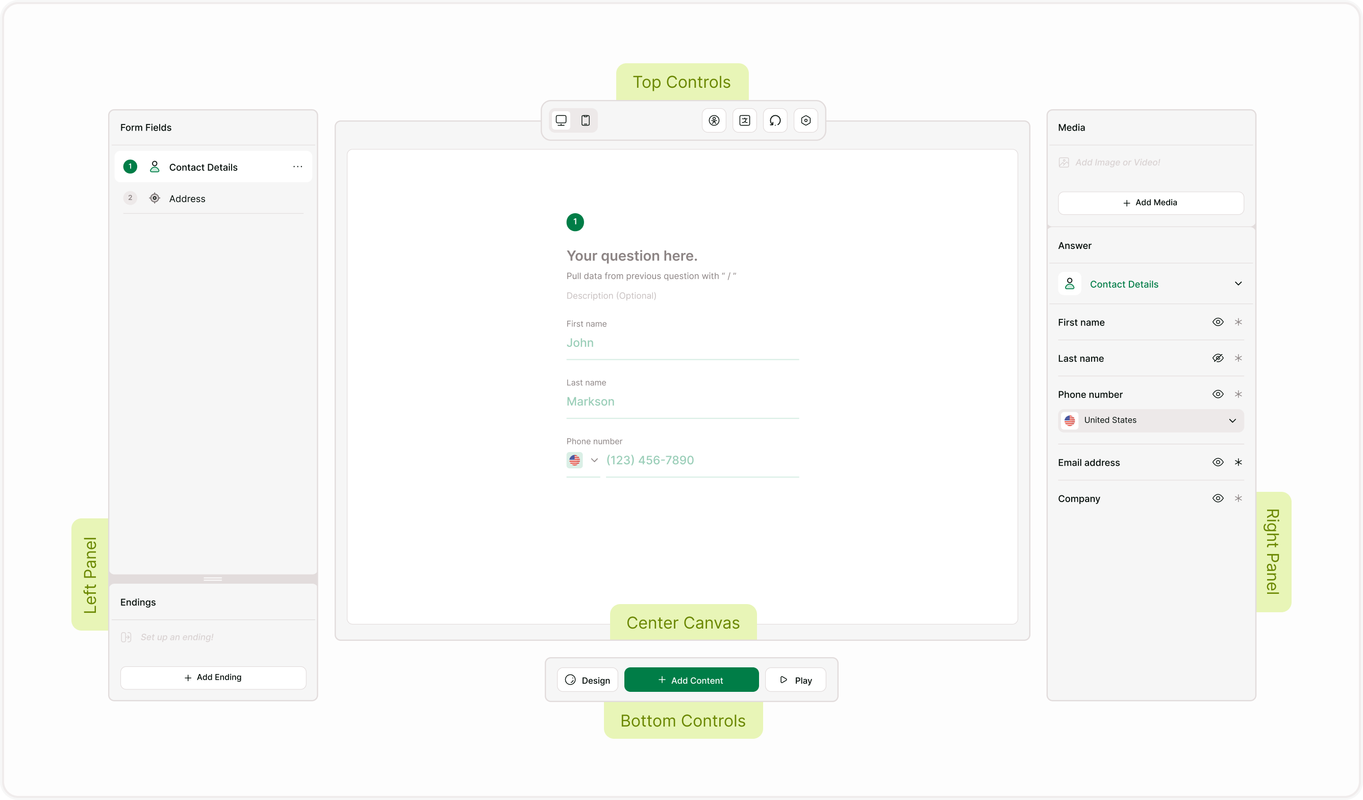
Center Canvas: Your Form Preview
The large center area shows the question or screen you’re currently editing. This is where you write questions, adjust labels, and preview how the form will appear to respondents. Every change you make in the side panels updates here instantly.
You can move through questions using the form field list or navigation controls. This real-time preview helps you design the flow and content of your form without switching between editing and preview modes.

Left Panel: Form Fields and Endings
The left side of the builder contains two main sections:
Form Fields
This list shows every question and screen in your form. You can click any item to edit it, reorder fields, or navigate quickly through longer forms. Each field is numbered so you can understand the sequence and flow.Endings
Endings allow you to control what respondents see after completing the form. You can create one or multiple endings and customize messages or actions based on responses.
Use this panel to organize your form structure from start to finish.

Right Panel: Media and Answer Settings
The right side of the builder is where you control how each question looks and behaves.
Media Panel
Add images or videos to support your question. This is useful for visual context, branding, or instructions.Answer Panel
Adjust how responses are collected. You can change field types, set required fields, and manage answer-specific settings depending on the selected field.
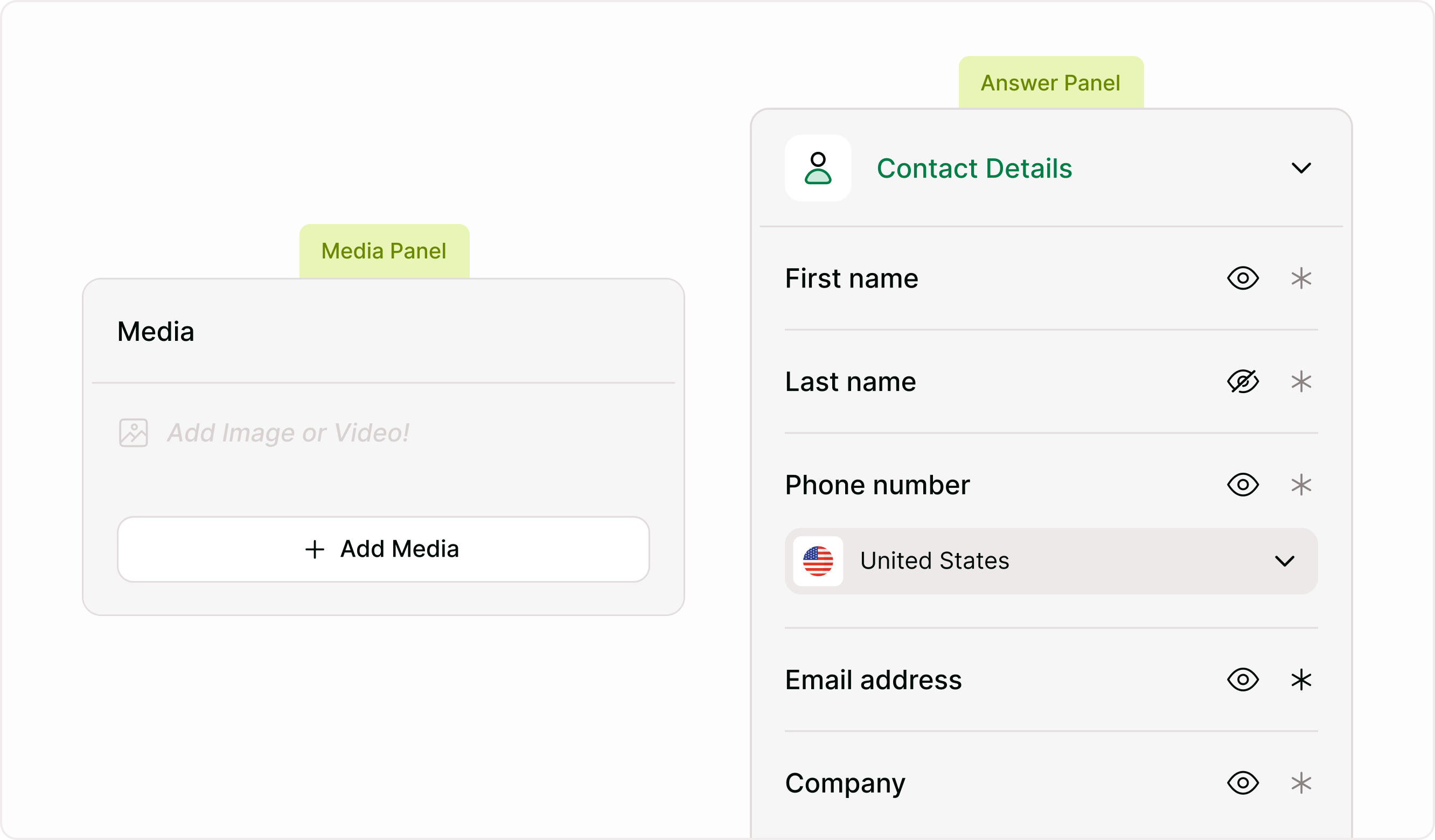
These panels update based on the question you’re editing, so you always see relevant options.
Top Controls: Builder Tools
At the top of the builder, you’ll find quick-access tools that help you manage and review your form while you build. These controls keep important options within reach so you can adjust settings, check versions, and prepare your form for different audiences without leaving the editor.
Device Preview
Switch between desktop and mobile views to see how the form looks on different screens.
Accessibility
Check accessibility options and ensure the form works for all users.
Translations
Manage language variations if your form supports multiple languages.
Version History
Review earlier versions of your form and track changes.
Settings
Settings opens your form configuration panel, where you can manage form details, availability, languages, and behavior.
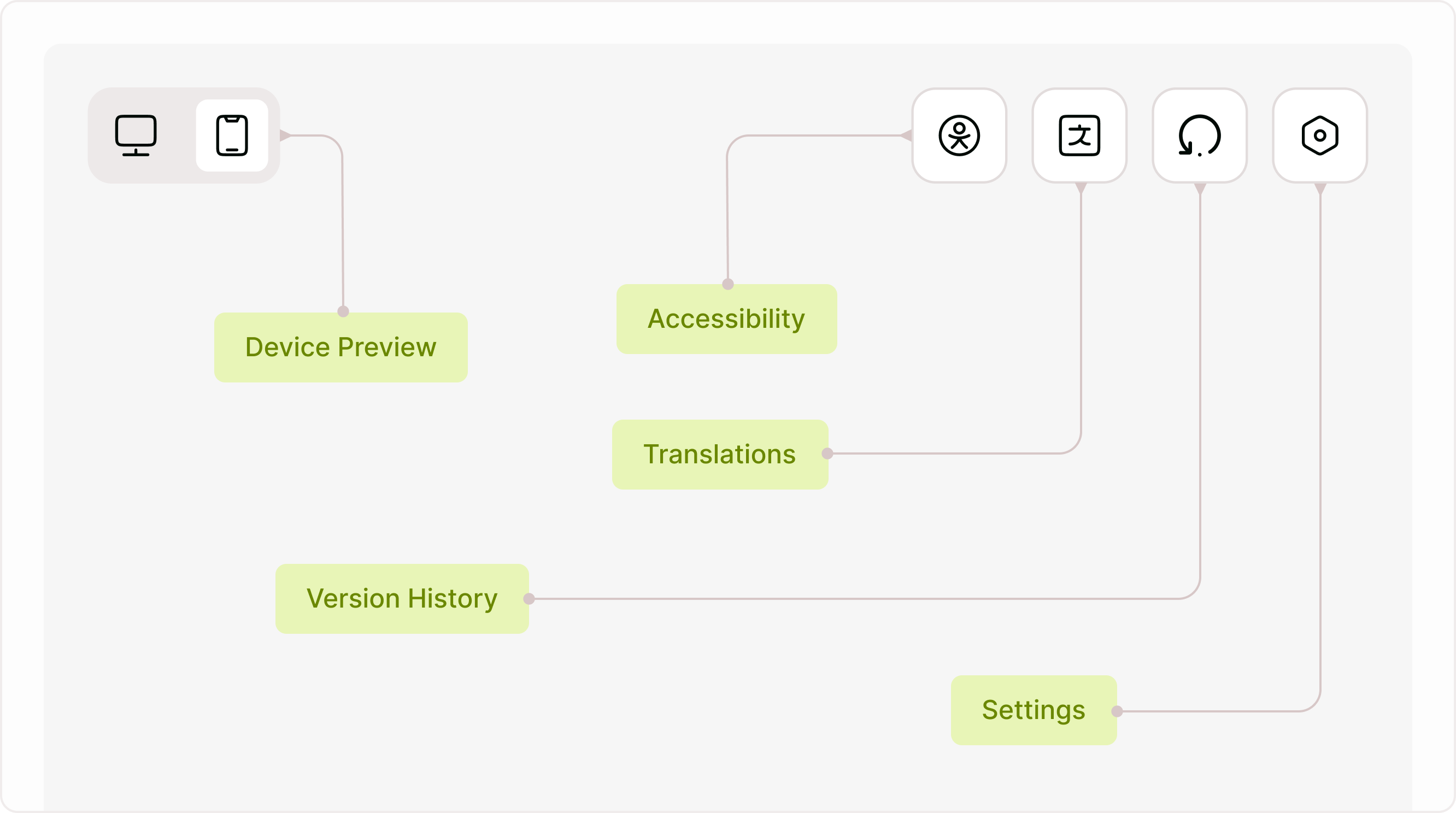
These tools help you refine and manage your form as it evolves.
Bottom Controls: Building and Previewing
At the bottom of the builder, you’ll find the main controls used while creating and reviewing your form. These actions help you switch between designing, adding new content, and checking how the form works from a respondent’s perspective. Keeping these controls visible makes it easy to build continuously, test changes instantly, and refine the experience without leaving the editor.
Design
Design opens styling options so you can adjust themes, fonts, colors, and layout while you build.
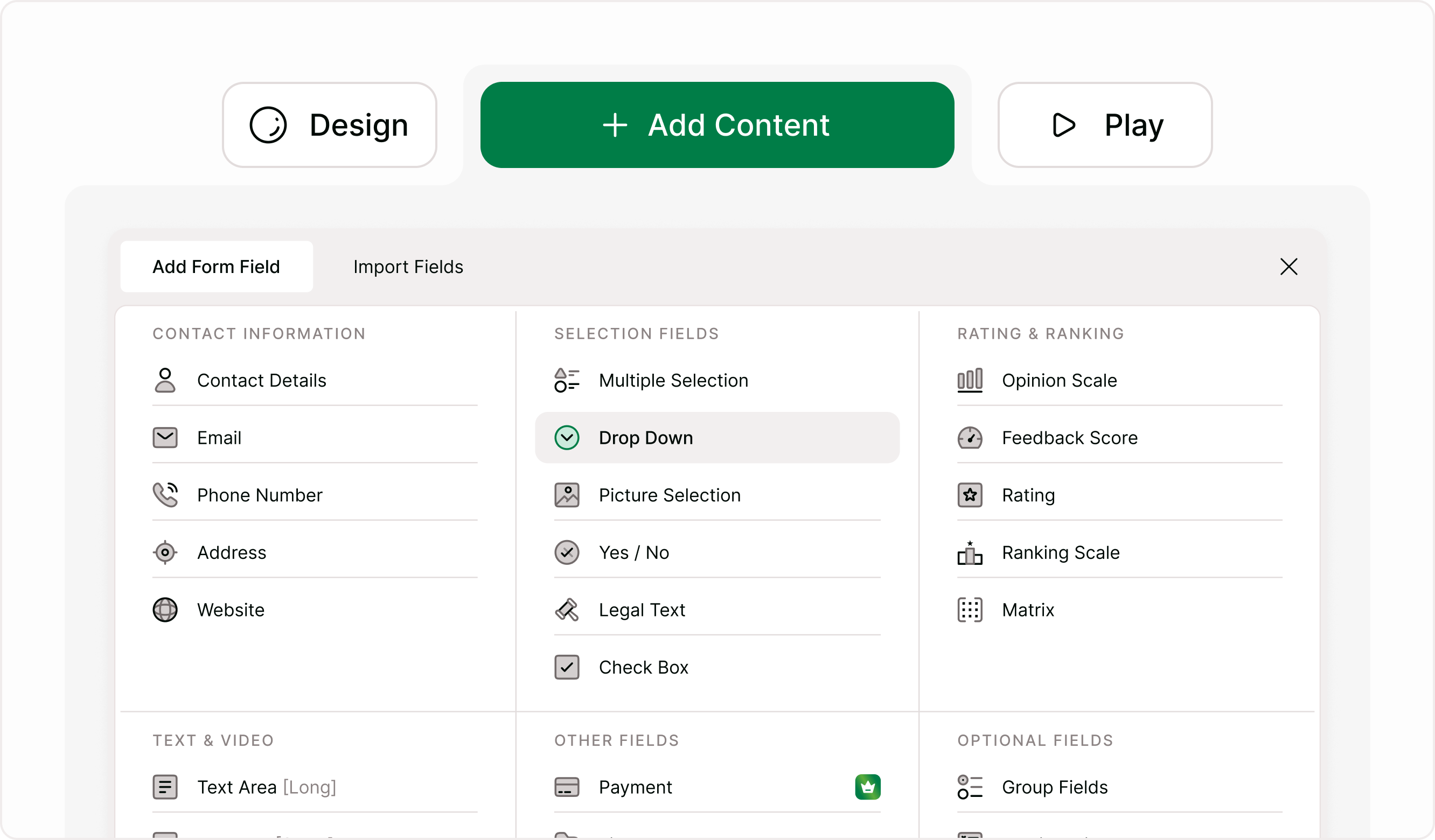
Add Content
Add Content lets you insert new fields, screens, and elements into your form at any time.
Play
Play allows you to preview the form exactly as respondents will see it, helping you test logic, flow, and overall usability before publishing.
These controls help you move between building, styling, and testing without leaving the editor.
How the Layout Helps You Build Faster
The builder layout is designed to keep everything visible and accessible. Instead of navigating through multiple pages, you can add fields, edit answers, adjust design, and preview your form in one place. This makes it easier to iterate quickly and ensure your form is ready before sharing.
Once you understand where everything is, creating forms becomes faster and more intuitive. You can focus on collecting the right information instead of searching for settings or controls.Once you understand where everything is, creating forms becomes faster and more intuitive. You can focus on collecting the right information instead of searching for settings or controls.
Summary
Kiwiform’s builder layout is designed to keep everything you need within reach while you create forms. The left and right panels help you add fields, manage content, and structure the experience, while the top and bottom controls let you preview, adjust settings, and refine how your form works. Once you understand where each tool lives, building forms becomes faster, clearer, and more predictable.
If you’re just getting started, explore each panel and use the preview option frequently. This helps you understand how respondents will experience your form and ensures everything works as expected before sharing it.