Where to Change Colors
Color settings are available when creating or editing a theme.
To customize colors:
Open your form in the builder.
Click Design.
Select Create New Theme or edit an existing theme.
Go to the General tab.
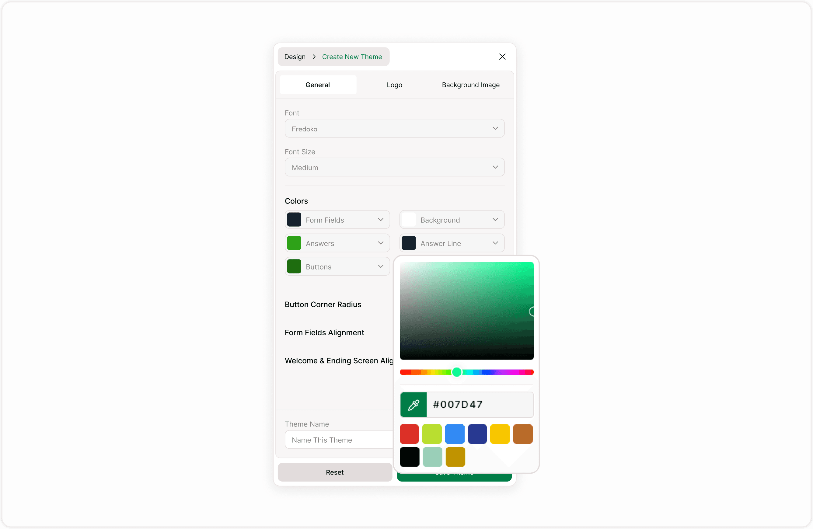
Locate the Colors section.
Each color option can be clicked to open the color picker.
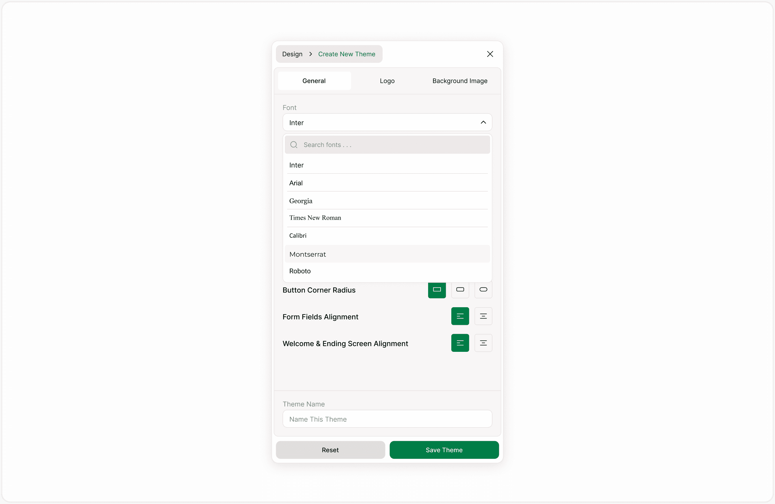
Available Color Controls
You can customize the following elements:
Form Fields
Controls the text color used inside form fields. This affects how prompts and content appear within each step.
Background
Sets the background color of the form. Choose a color that complements your brand while maintaining strong contrast with text elements.
Answers
Defines the highlight color used when respondents select an option. This is important for visual feedback.
Answers Line
Controls border or separator colors for answer elements. It helps define structure and improve clarity.
Buttons
Sets the background color of buttons, such as Next or Submit.
Buttons Text
Controls the text color inside buttons. Ensure high contrast for accessibility.
Using the Color Picker
When you click on a color setting, a color picker opens.
You can:
Select a color visually.
Adjust saturation and brightness.
Use the color spectrum slider.
Enter a hex code (for example: #000000).
Choose from preset color swatches.
This flexibility allows you to match exact brand colors or experiment with variations.
How Colors Affect Your Form
Color settings apply to:
Form Fields
Interactive elements
Buttons
Background surfaces
Selected answers
If the form uses a theme, updating colors inside the theme will affect all forms using that theme.
Always preview your form after making changes to ensure visual balance and readability.
Accessibility and Contrast Guidelines
When choosing colors, follow these best practices:
Use high contrast between text and background.
Avoid light text on light backgrounds.
Ensure buttons remain clearly visible.
Test selected answer colors for clarity.
Check readability on mobile devices.
Strong contrast improves usability and ensures your form is accessible to a wider audience.
Common Use Cases
You may want to update colors when:
Aligning forms with brand guidelines.
Creating event-specific designs.
Designing seasonal campaigns.
Improving accessibility.
Differentiating internal and external forms.
Using themes ensures color consistency across multiple forms without repeating manual setup.
Tips for Consistent Branding
Use primary brand colors for buttons.
Keep background colors subtle for long forms.
Avoid using too many accent colors.
Maintain consistency across all themes in your workspace.
Duplicate a theme before testing major color changes.
A well-designed color scheme improves clarity, engagement, and trust.
Summary
This guide explains how to customize form colors inside the Design panel, what each color setting controls, and how to choose combinations that improve readability and accessibility. You will also learn how color settings work within themes and how updates affect your forms.