Let respondents choose using images instead of text
The Picture Selection field lets you create visual choice-based questions where respondents select one or more options represented by images. It’s ideal for product preferences, design voting, event selections, quizzes, and visual surveys.
In Kiwiform, a free Typeform alternative, Picture Selection makes forms more engaging, interactive, and conversion-focused by replacing plain text options with clickable images.
Use this field when:
You want faster decision-making
Visual context matters more than text
You want higher engagement and response rates
You are showcasing products, designs, or concepts
How to Add a Picture Selection Field
Step 1: Add the field
Open your form in the Form tab.
Click + Add Content.
Select Picture Selection from the Answer type dropdown.
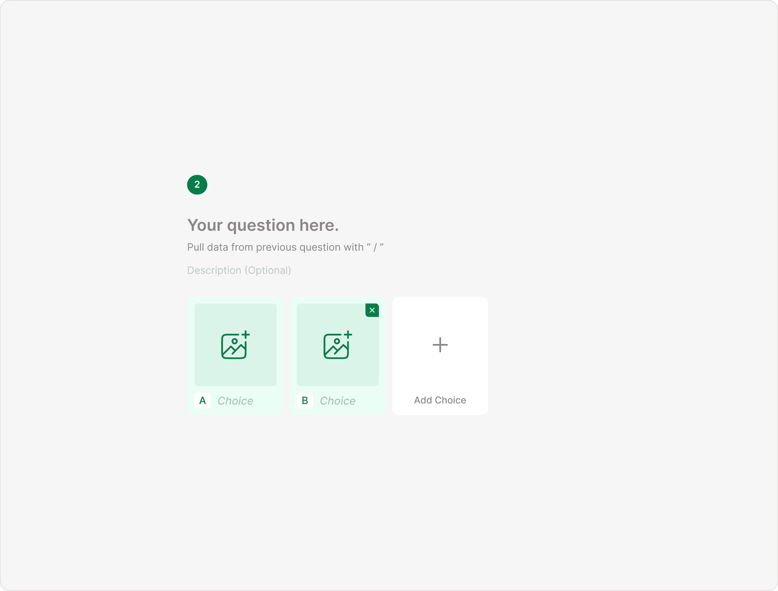
Step 2: Add choices
Each picture is a choice.
Click Add Choice.
Upload an image.
Add a label (if Labels toggle is enabled).
Repeat for additional choices.
You can add as many picture options as needed.
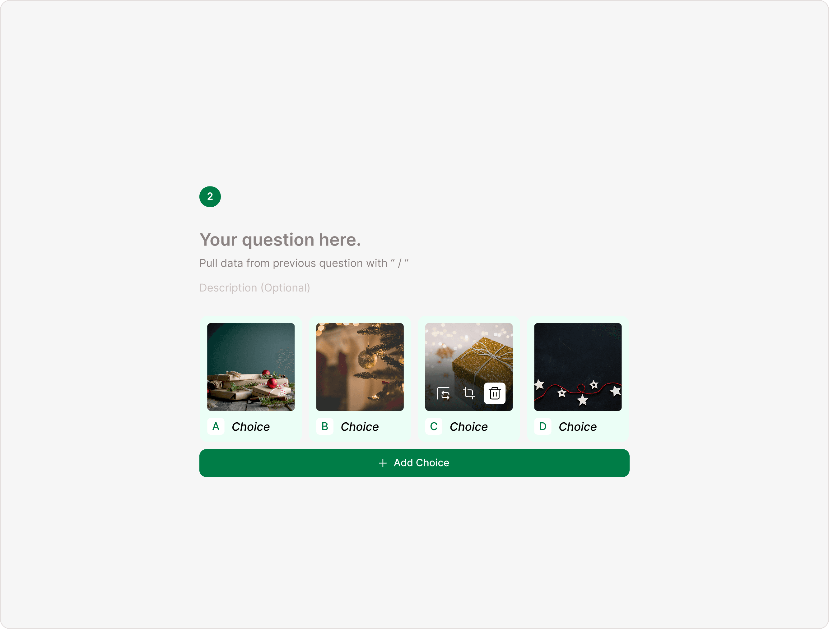
Uploading and Managing Images
When you upload an image to a choice, you can manage it directly from the canvas.
On Hover Options (Important)
When you hover over a picture choice, you’ll see:
Replace Image – Upload a different image
Edit Image – Crop or adjust the image
Delete Image – Remove only the uploaded image
Close (X) – Remove the entire choice
This makes editing fast and visual, no need to open additional panels.
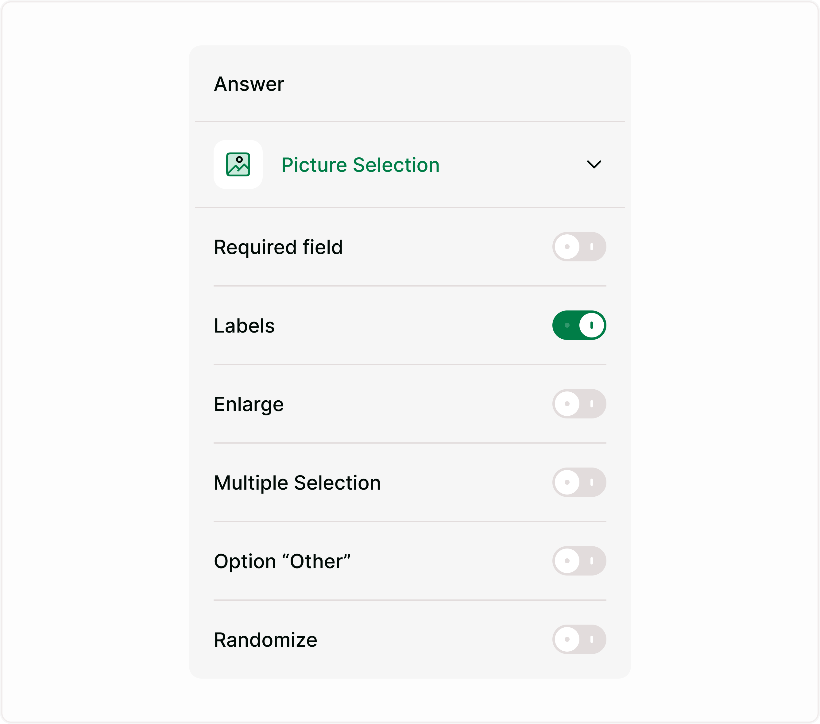
Picture Selection Settings (Answer Panel)
The right-side Answer panel includes powerful configuration options.
Required Field
Turn this on if respondents must select at least one option before continuing.
Use this when:
Running official votes
Collecting critical product feedback
Avoiding skipped responses
Labels
When enabled, labels appear below each image.
Turn Labels ON if:
The image may need clarification
You want accessibility support
You want both visual + text context
Turn Labels OFF if:
Images are self-explanatory
You want a clean, minimal look
Enlarge
When enabled, respondents can click to view the image in a larger preview.
Use this when:
Showing product images
Displaying detailed designs
Running design evaluations
Sharing infographics or artwork
This improves usability for mobile users and detailed visuals.
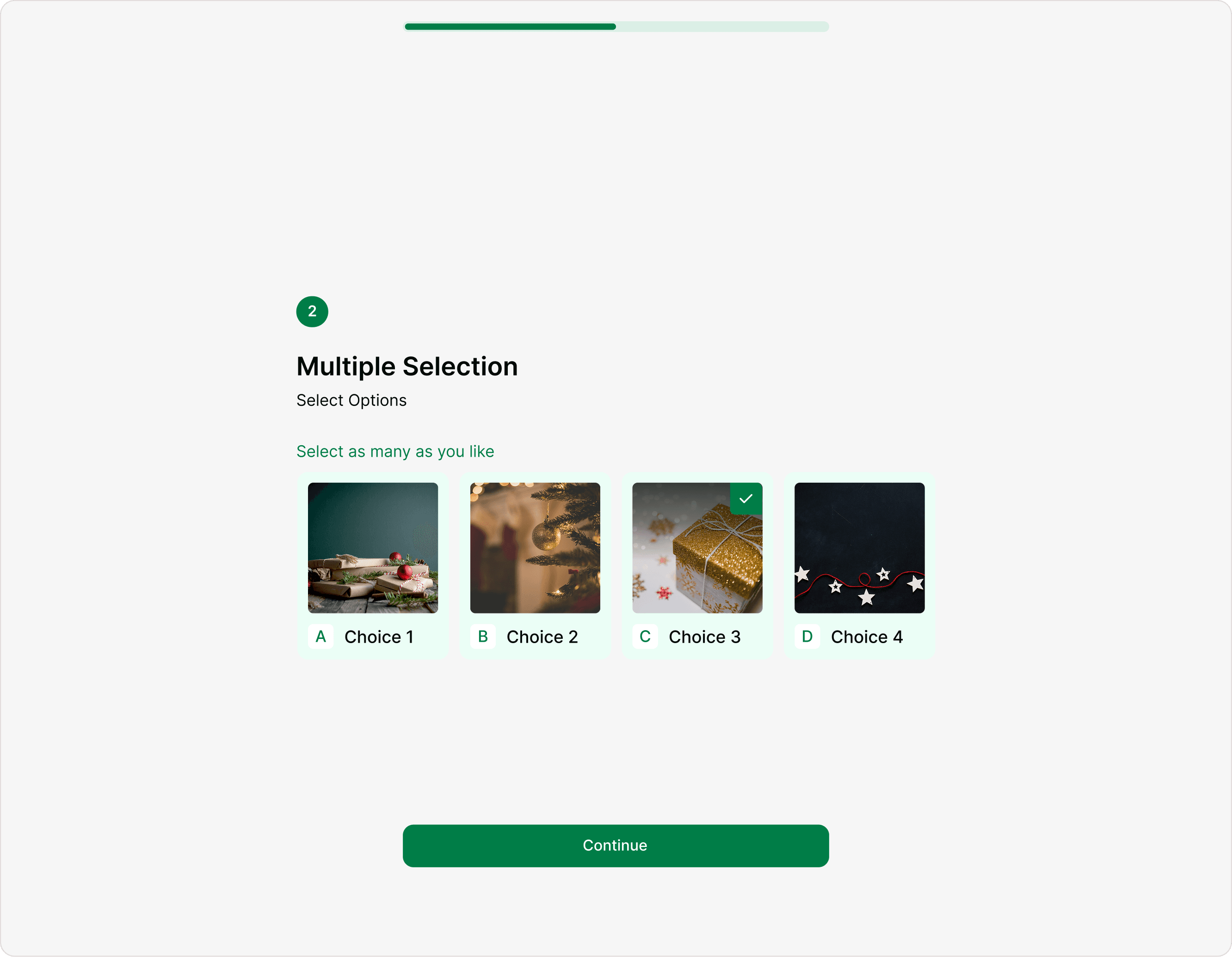
Multiple Selection
Allow respondents to choose more than one image.
Use this when:
Selecting multiple interests
Choosing several preferred products
Picking multiple design styles
Creating checklist-style visual forms
If turned off, respondents can select only one option.
Option “Other”
When enabled, an additional “Other” option appears, allowing respondents to enter a custom answer.
Use this when:
You don’t want to restrict answers
You want to capture unexpected preferences
You are conducting exploratory research
Randomize
Randomizes the order of picture choices for each respondent.
Use this when:
Reduce selection bias
Improve fairness in voting
Run unbiased A/B testing
Conduct research surveys
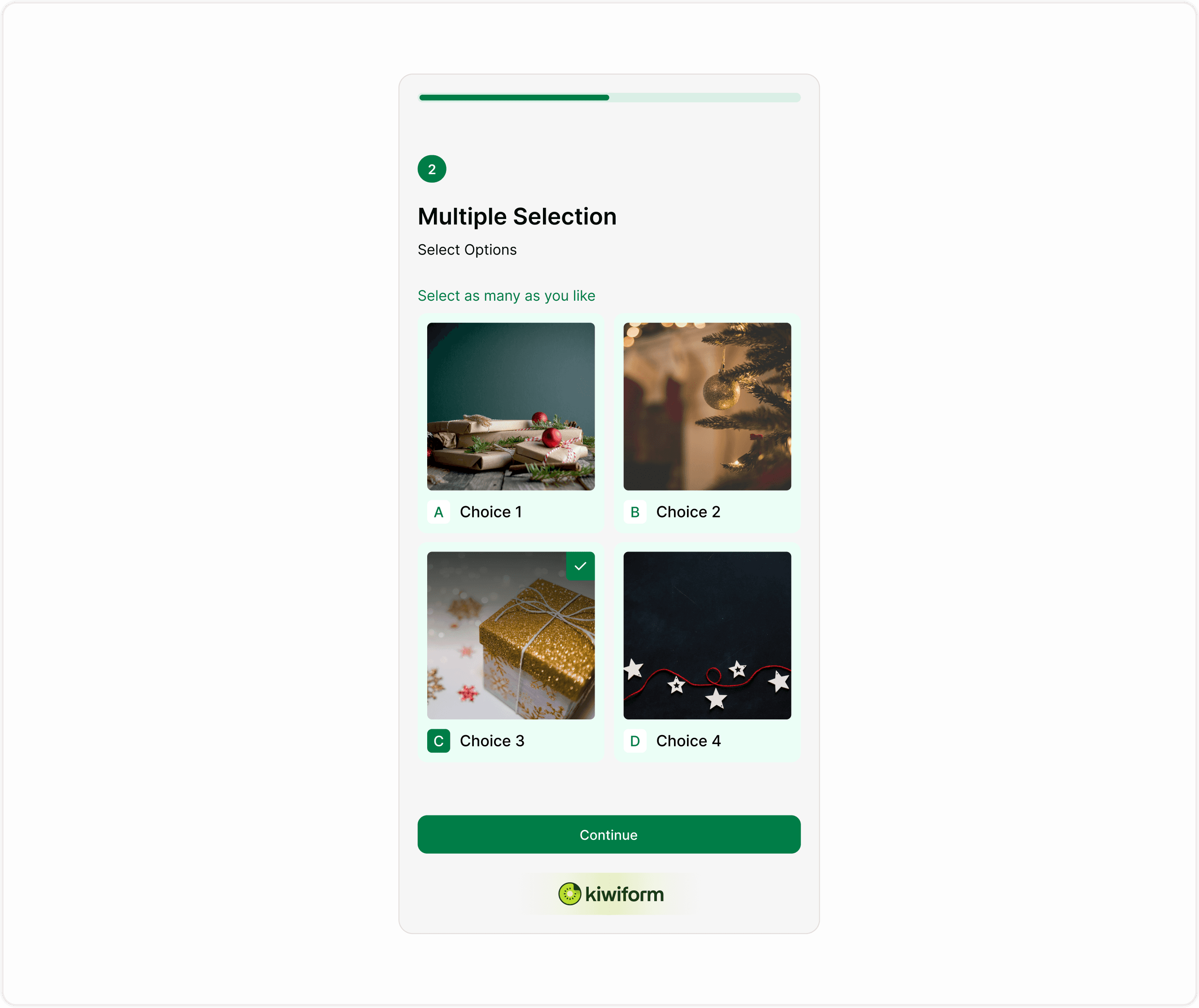
How Picture Selection Appears to Respondents
In preview or live mode:
Images appear as selectable cards
Selected options are visually highlighted
Labels appear (if enabled)
“Other” field appears (if enabled)
Multiple selections are supported (if enabled)
The layout is clean, mobile-friendly, and optimized for engagement.
Respondent experience
For respondents, the Address field appears as a clean, structured set of inputs.
They can move through each line naturally without confusion, and only the fields you’ve enabled will be shown.
This keeps the form easy to complete while ensuring you still get accurate location data.
Why Use Picture Selection in Kiwiform?
Unlike static forms, Kiwiform combines:
Visual engagement
Drag-and-drop simplicity
Image editing tools
Bias-reduction tools (Randomize)
Flexible answer settings
Clean respondent experience
Troubleshooting
Images not displaying? Check file size and format.
Image looks cropped? Use the Edit Image option to adjust framing.
Too many choices? Simplify to improve decision speed.
Respondents skipping the question? Enable Required field.
Common use cases
Product preference surveys
Restaurant menu selection
Fashion voting
Logo or branding selection
Event theme selection
Interior design feedback
Creative portfolio voting
E-commerce product quizzes
Picture Selection increases interaction and improves completion rates compared to plain text choices.
Best practices
Use high-quality images: Clear, well-lit images increase trust and clarity.
Keep consistent aspect ratios: Avoid mixing portrait and landscape styles.
Limit options: Too many images can overwhelm respondents. 4–8 is ideal.
Use Labels wisely: If images are abstract, always enable Labels.
Enable Enlarge for details: Helpful for product or design reviews.
Summary
The Picture Selection field helps you create visual, engaging, and interactive forms. It replaces traditional text-based multiple choice with image-driven selection, increasing clarity and response quality. Use it when visuals matter. Configure it easily with settings like Multiple Selection, Labels, Enlarge, Other option, and Randomize to create flexible and conversion-friendly forms.